Letting TCS travellers explore a destination before they book
00.Overview
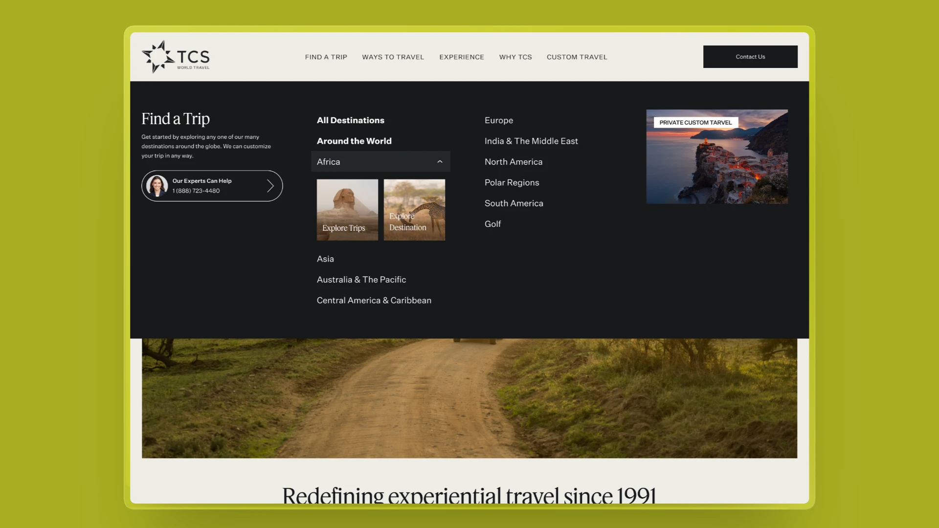
TCS World Travel plans luxury trips around the world. I designed and built a new step in the website's main menu: after picking a continent, travellers choose to explore the destination or browse trips. Both variants are built in code, ready to test against the current menu.
- Role
- End-to-end Design & Front-end Build
- Team
- Rohit Rayala (CRO), Sharayu Jadhav (Product Manager), Hriday Gami (Design), Sandy Tang (Content)
- Timeline
- June – July 2026
Briefed in June · Designs approved 15 Jul · Built for an A/B/C test
01.One click, and straight to the trips, even if you were still exploring
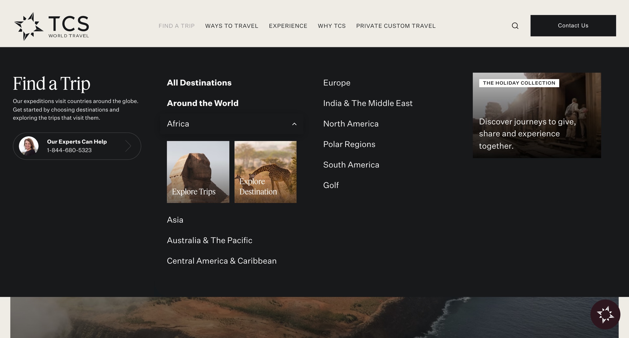
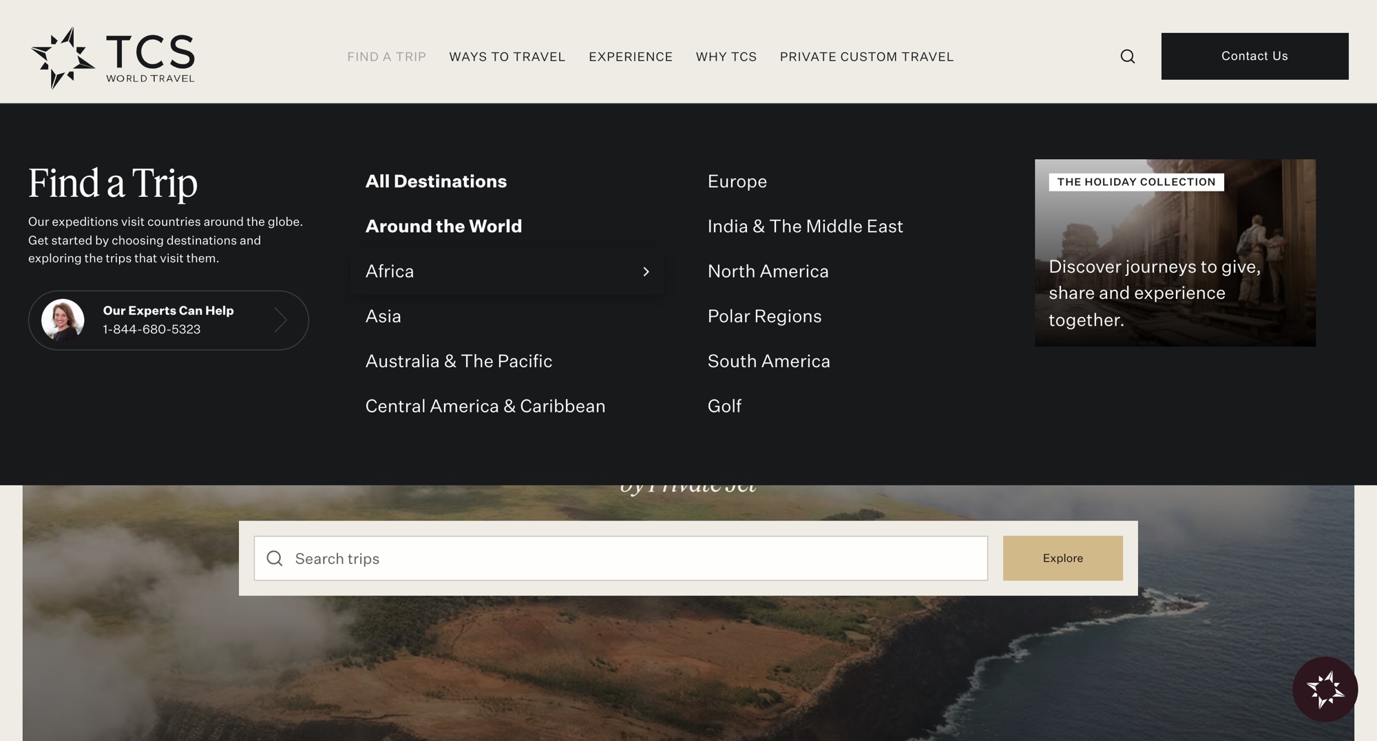
On the TCS website, clicking a continent in the menu took you straight to a list of trips. That works if you already know where you want to go. But luxury trips take months to plan. Many people start by exploring a place, not by comparing trips.
The Problem Statement
Picking a continent sent every visitor straight to a list of trips, even people still deciding where to go. The CRO team measured that 38% left the trip list without opening a single trip, so TCS lost them at the very first step.
02.What we knew going in
The CRO ticket came with a hypothesis. Before designing anything, I checked the live menu to see how big the gap was.
If travellers get a clear choice after picking a continent, more of them will keep going, because explorers can learn about the place first, and planners can go straight to trips.
The menu hid the pages explorers needed
The live menu made this easy to check. Every continent link pointed to a trip search. Not one pointed to a destination page, even though most continents already had one.
menu links take you straight to a list of trips
menu links lead to a destination page, though 9 continents already have one
of people leave the trip list without opening a trip, measured by the CRO team
What shaped the design
Before drawing anything, five things set the rules: three about the people using the menu, and two constraints from the ticket.
A long, careful decision
Featured TCS expeditions start at $135k per person and are planned months ahead. People explore a place long before they choose a trip.
Two kinds of visitor, one path
The ticket named two kinds of visitor: people exploring a place, and people planning a trip. The menu only served the planners.
Neither path should win by design
I asked if the design should favour Destinations, since the test measures it. We agreed to treat both equally, so the test measures intent, not my layout.
Not every continent has a destination page
North America and Golf only have trips. The design had to fall back cleanly, with no broken or empty option.
It had to work on a phone too
The test runs on desktop, iPhone and Android. Two paths had to fit a narrow menu, with taps big enough to hit.
What success looked like: more people getting past the menu. After picking a continent, more of them should land on a destination page or a trip list, and fewer should leave without choosing. A visit counts only when that page loads, not on the click.
03.What we explored, and the three we showed the business
I started with quick prototypes to test how the choice should behave, not how it should look. I built them with Helix on Claude Code, so the business could click through each one. The two paths open right under the continent you click, so the menu never jumps away. Variant 1 is where the phone problem showed up, so I made two more variants. The business liked both, so we chose to test both.
Variant 1
Text links side by side, on every screen
What worked
- On desktop, both paths sit next to each other at equal weight
What didn’t
- On a phone, the two links got cramped next to each other
- The tap areas became too small to hit reliably
Rohit Rayala, CRO Add a version with the two paths side by side, not stacked.
Sharayu Jadhav, Product Manager On a phone, the tap areas get too cramped.
Variant 2
Text links that open under the continent
What worked
- The choice opens right under the continent you clicked
- The selected continent stays highlighted while its paths are open
- Stacked links work the same way on desktop and on a phone
- Needs no new images, so it works for every continent from day one
What didn’t
- Plain links are quieter; the team expected them to draw fewer clicks than images
Variant 3
Image cards that open under the continent
What worked
- A photo for each path makes exploring a place feel inviting
- Two big cards side by side are easy to tap, even on a phone
- Opens in place, with the selected continent highlighted
What didn’t
- Needs an approved pair of photos for every continent before it can ship
- The cards push the rest of the continent list further down
Why we tested both instead of choosing
Variant 1 taught us the layout rule: cards can sit side by side, links stack. That left two good designs, and no reason to guess between them.
- 01
No clear winner
Each design had its own strength. The links stay light and work everywhere; the cards make exploring a place feel inviting.
- 02
An open question
The hypothesis asked if image cards draw more clicks than text links. Only real visitors, not a meeting, could answer that.
04.How the final designs work
Both test designs share one flow: pick a continent, choose how to explore it, and land on the right page. These three details make that flow work. Each detail shows both designs side by side: Variant 2 (text links) and Variant 3 (image cards).
1. A new step, but not a new page
Adding a choice adds a step, and every extra step is a chance to lose someone. So the two paths open right under the continent you clicked, inside the menu. The choice costs one more tap, not another page to load, and the continent stays highlighted so you always see what you picked.
Variant 2
0:00 / 0:00Variant 3
0:00 / 0:00
2. Two options that look equal
Both labels start with “Explore”, so neither feels like the main path. Explore Trips comes first, so people who used the old menu still find trips where they expect them.
Variant 2
Variant 3
3. The same choice on a phone
The test runs on desktop, iPhone and Android, so the choice had to fit a narrow menu. Variant 1 showed that two links side by side get cramped and hard to tap. So on a phone, the text links stack, one per row, and the image cards stay side by side, because each card is big enough to tap.
Variant 2
0:00 / 0:00Variant 3
0:00 / 0:00
05.Built in code, ready to test
Both designs were approved on 15 July 2026, and I built them in code as two variants of the menu. The test splits visitors three ways against the current menu.
of visitors keep today's menu, the control
of visitors get Variant 2, the text links
of visitors get Variant 3, the image cards
How it was built
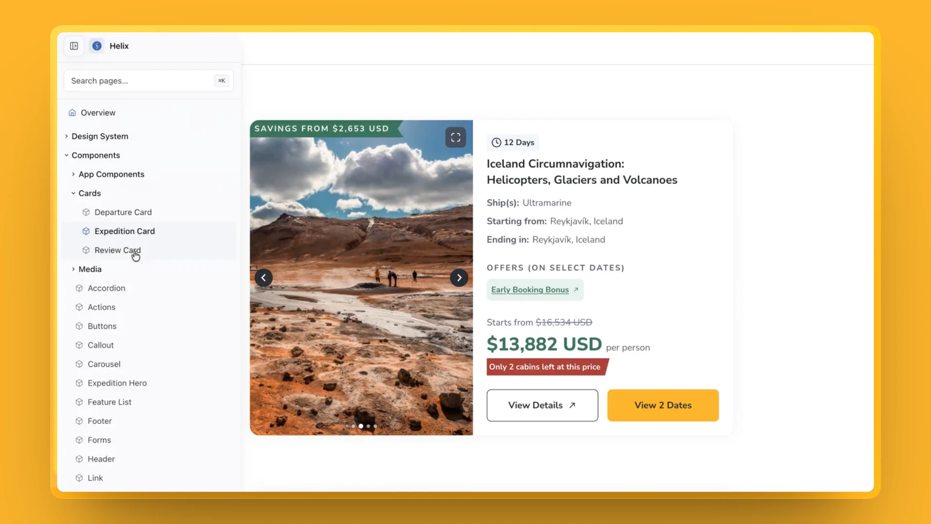
Both variants were designed in high fidelity with Helix on Claude Code, so every screen was built only from the design system's components and tokens. From there, the code went through the same review as any developer's:
- Branch off main
- Build both variants
- Code review
- Merge to main
Once it was merged, the developers picked it up to set up the test.
- 01
Both variants, in code
Desktop and phone front end for the text links and the image cards.
- 02
Photos for every continent
An approved photo pair each; North America and Golf stay trips-only.
- 03
The behaviour, written down
How the paths open, highlight and close, checked against ten criteria.
06.Where it stands
Both variants are built and reviewed, so the test is ready to run. There are no results to share yet.
Impact so far
Before a single result comes in, the work has already changed two things.
new tracking events, so TCS can see how people use the menu
from the first question to two approved designs
What happens next
When the test reads out, we'll compare three things across the control and both variants: how many people reach a page after picking a continent, which path they choose, and the drop-off rate, meaning how many leave without choosing. A journey only counts when the next page actually loads. Each result has a plan.
If Variant 2 wins
Ship the text links. They need no photos, so every continent can switch over on day one.
If Variant 3 wins
Ship the image cards. Every continent's photo pair is already approved, so nothing waits on content.
If today’s menu wins
Keep the menu as it is. The 8 new tracking events still show which path people want.
Either way, if Explore Destination draws clicks, the same choice can be offered beyond the menu.
07.What I learned
Fairness is a design decision. In an A/B test the layout can tip the result. Settling early that both paths carry equal weight meant the test measures intent, not my emphasis.
Prototype the behaviour, not pixels. Two rough interaction prototypes let the team compare how each choice felt in a single review, and decide to test both instead of debating one.
Design the edge cases early. The cramped phone layout and the missing destination pages were solved in the prototypes, so the build started with those questions answered.
Keep reading
Down the hall
 Room 104Designing Bella, the desk bell that hosts this portfolio, in Claude CodeA front-desk bell in the navbar that counts how long you actually spend here.
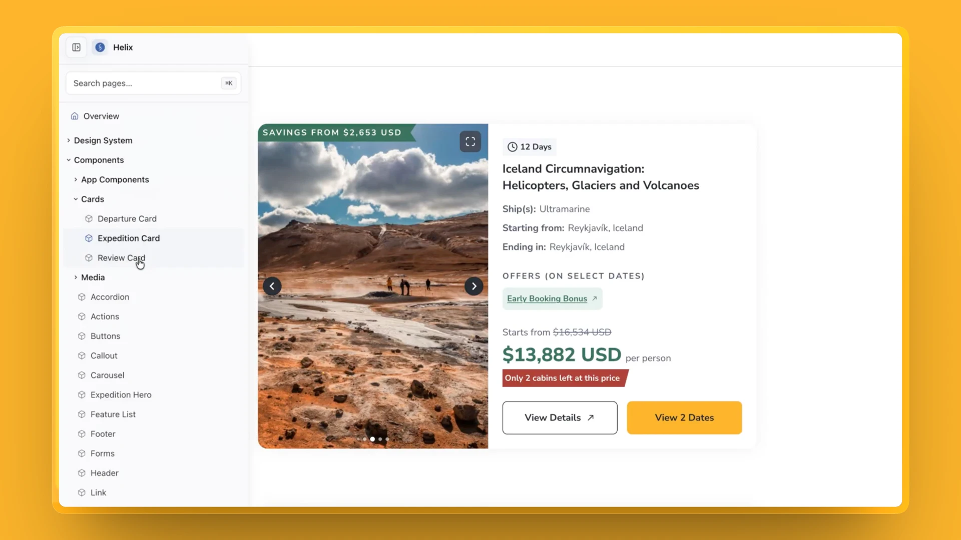 Room 101Shipping designs in half the time with Helix on Claude CodeA design-system skill for Claude Code, so designers build from our real components and what we design is what ships.