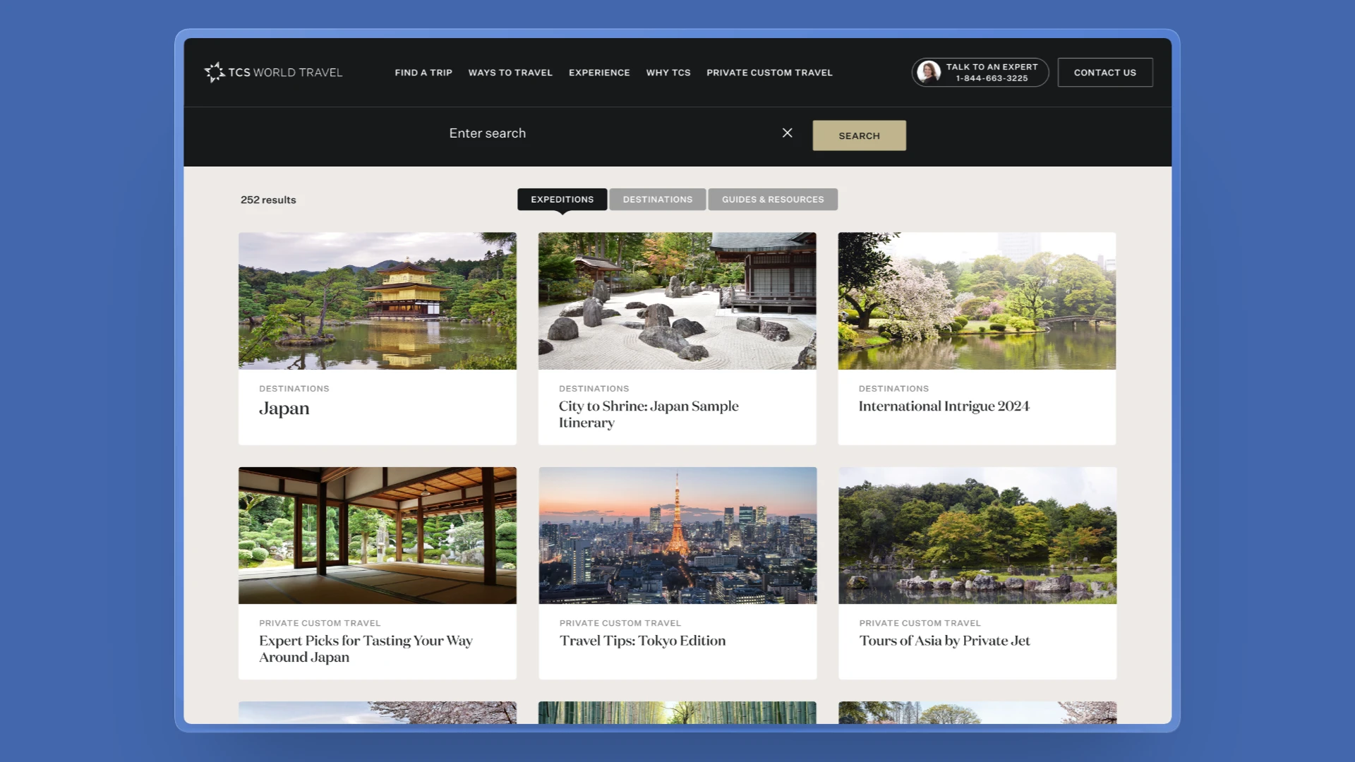
From every trip at once to the few that fit: filters for TCS search
00.Overview
TCS's search page showed every upcoming trip in one long list, with no way to narrow it. I redesigned it so travellers can narrow results by destination, trip type, date and length, see how many trips match, and see each trip's route on its card. Developers built it, and it has been live since July 2026.
- Role
- End-to-end Design & Developer Handoff
- Team
- Sharayu Jadhav (Product Owner), Travis Snelling, Sandy Tang (Content), TCS developers (Engineering)
- Timeline
- June – July 2026
Briefed in June 2026 · V1 built and launched in July 2026
01.Search made it hard for travellers to find the right trip
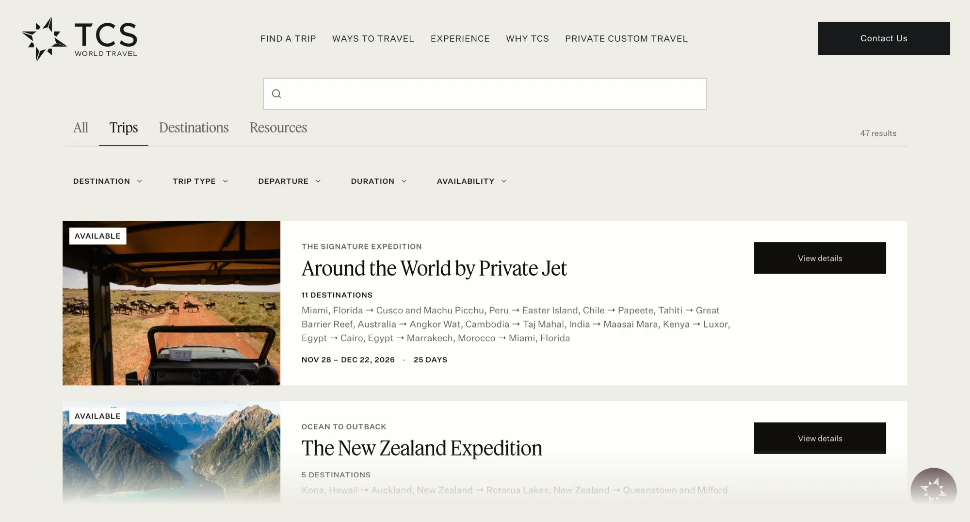
The project started with a request to improve the search experience on the TCS website. The existing search results didn't offer filtering options, making it difficult for travellers to narrow down relevant itineraries. The brief called for a filtered search experience that would help users refine results based on trip characteristics and availability.
Search performance data wasn't available to the design team, making it difficult to understand how often travellers encountered these issues.
The Problem Statement
Search results offered no filters, making it difficult for travellers to narrow the list to trips that matched their interests. Finding a relevant itinerary meant spending more time navigating the results before they could explore a trip further or make an enquiry.
02.Understanding the existing search experience
I started by auditing the existing search page, reviewing earlier search tickets and conducting structured interviews with frequent TCS travellers. With no search analytics available to the design team, these helped me understand how travellers searched for trips and where the experience fell short.
What we heard from travellers
7 frequent TCS travellers interviewed. All were existing TCS customers who volunteered, and I asked each of them a few questions. Two recurring observations stood out:
Frequent TCS traveller I want to know where the trip goes and which destinations it covers without having to open every trip.
Frequent TCS traveller The number of matching trips is easy to miss when I’m changing filters.
These conversations highlighted two important needs: better visibility into trip itineraries and clearer feedback when exploring search results.
What the product audit revealed
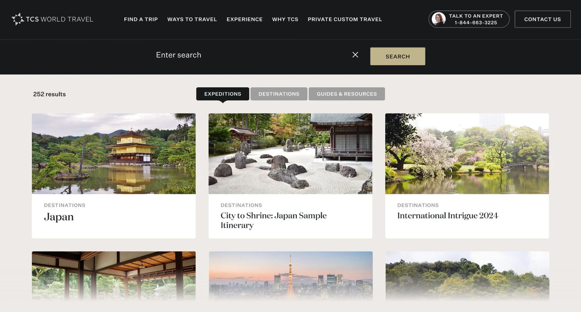
The existing search page was split across three tabs: Expeditions, Destinations, and Guides & Resources. Within Expeditions, upcoming trips appeared in one long list, ordered by departure date.
- Trip cards in one list42
- Filters and sorting controls0
- Waitlisted trips in the results9 of 42
- Trip names mentioning a country7 of 32
Travellers had limited ways to narrow the list, distinguish available trips or understand where a journey went from the card itself.
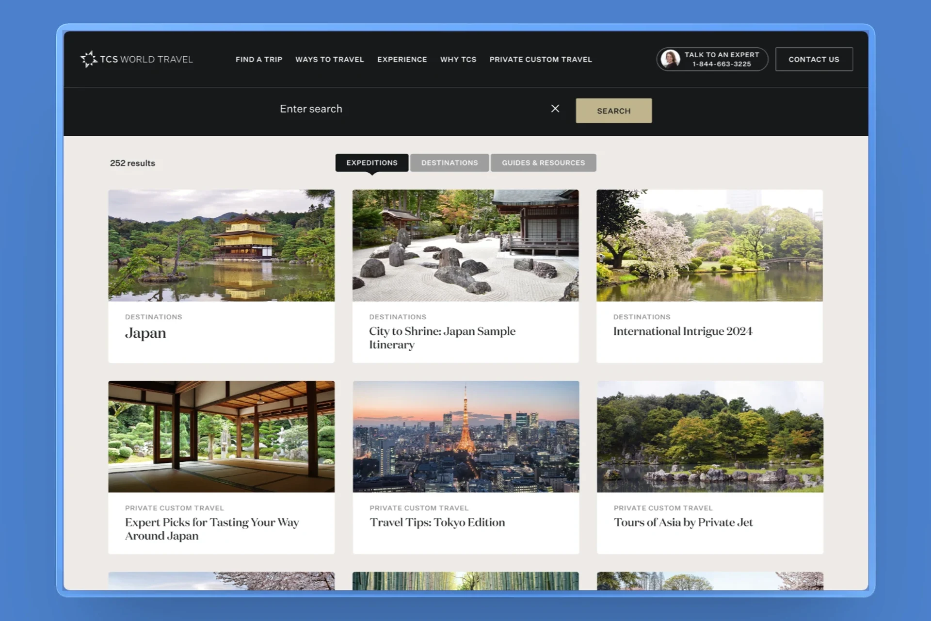
- 252 results, no way to narrow
- Tabs only, no filters or sort
- A name, but no route
Turning findings into design priorities
The brief asked for filters, but the interviews and audit showed travellers also needed to see where a trip goes and how their choices changed the results. That turned the brief into one question: how might we make it easier for travellers to find relevant itineraries through TCS search?
The interviews and product audit shaped five priorities for the redesign:
Narrow by how people plan
Introduce filters for destination, trip type, departure and availability.
Make search feedback visible
Bring the result count closer to the filters and make applied selections easy to identify and remove.
Show the full trip route
Surface the destinations and route directly on each trip card.
Make availability easier to understand
Allow travellers to separate bookable trips from waitlisted ones.
Connect navigation to search
Make region links open search with the corresponding destination filter applied.
What success looked like: Travellers could narrow a long list to relevant trips, understand where each journey goes and make sense of their results without unnecessary clicks.
03.Exploring three ways to find the right trip
The brief defined the goal, but left the interaction details open. I explored three different search layouts, each taking a different approach to narrowing results and presenting trip information.
I compared how each concept addressed the five research findings, particularly how travellers could filter trips and understand their routes without opening individual cards.
Each concept is recreated as a clickable prototype using the 45 live trips, making it possible to compare the approaches in a realistic search experience.
Option 1
Region shortcuts, with country tags on the card
What worked
- Every region is one tap away and always in view
- Simple to build: one filter, one switch and a tag list on the card
What didn’t
- Only narrows by place, one region at a time: no month, kind of trip or length
- Card tags show three countries and hide the rest, so a trip’s tags can leave out the very region you picked
Option 2
A Sort menu, with every country on the card
What worked
- One control everyone already knows from shopping sites
- The card lists every country the trip goes to
What didn’t
- Reordered, not shorter: all 45 trips are still there to scroll
- A region link in the menu can only type the region’s name into search, which finds about a third of the trips that go there
Option 3
A row of filters, with the full route on the card
What worked
- Five filters fit in one row, each showing how many trips it leaves before you pick it
- Every choice shows as a chip, and Clear filters resets them all
- A wide card keeps room for the full route
- Find a Trip’s region links open search with that filter on
What didn’t
- The result count is easy to miss: small grey text at the far right, away from the filters and chips that change it
04.How the new search works
V1 kept the familiar tabs and added five changes, one for each problem the research found. Together, they help travellers narrow a long list down to the trips that suit them.
1. Filters that narrow down the search
Introduced five filters above the results: destination, trip type, departure, duration and availability. Each option shows how many trips it will return before you pick it, and on phones the filters open in a bottom sheet.
2. Clear feedback on applied filters
Added a matching result count and removable filter chips to make the search state clear. Travellers can see which selections are active, remove individual filters or clear them all.
3. More context in every trip card
Redesigned the trip card to show the full route alongside the name and dates, so travellers can see every stop without opening the trip.
4. Connecting navigation to search
In the site’s top menu, Find a Trip lists regions like Africa and Europe. Those links used to type the region’s name into search, which only found trips that mentioned that word. Now each link opens search with that region’s filter already on, so it shows every trip in the region, three times as many as before, and you can add a month or trip type straight away.
Every filter is saved in the page address, so a menu link or a shared link opens search with the same filters already on.
| Filter on the page | Field in Algolia | In the address |
|---|---|---|
| Destinations | destination_parents | destinations= |
| Trip type | trip_categories | trip-types= |
| Departure | departure_year_month | departure= |
| Duration | duration_range | duration= |
| Availability | availability | availability= |
5. Keeping travellers moving when no results match
Designed a no-results state that offers ways to keep exploring. Alongside contact details for a travel expert and Private Custom Travel, it introduces curated alternative trips.
05.What changed after launch
V1 went live in July 2026, and we've tracked it every month since. Here's what four months of results show.
1.3×
More searches that lead to a trip
The result I’m proudest of: each month, more travellers who searched went on to open a trip. Filters, clearer cards and menu links that land on the right trips made it easier to find one worth a closer look.
- Searches that ended with a trip opened
- Up 8 points from July to October.
- 24%32%, +8 pts
- Trips shown from a menu region link
- Three times as many as the old text search.
- 722, 3×
- Searches that found no trips
- About 1 in 7 in October, mostly phrases that mix a place and a season.
- 14%
What V1 doesn't do yet
Four months live also showed where V1 falls short. V2 is designed to close each gap, and will be built with Helix on Claude Code.
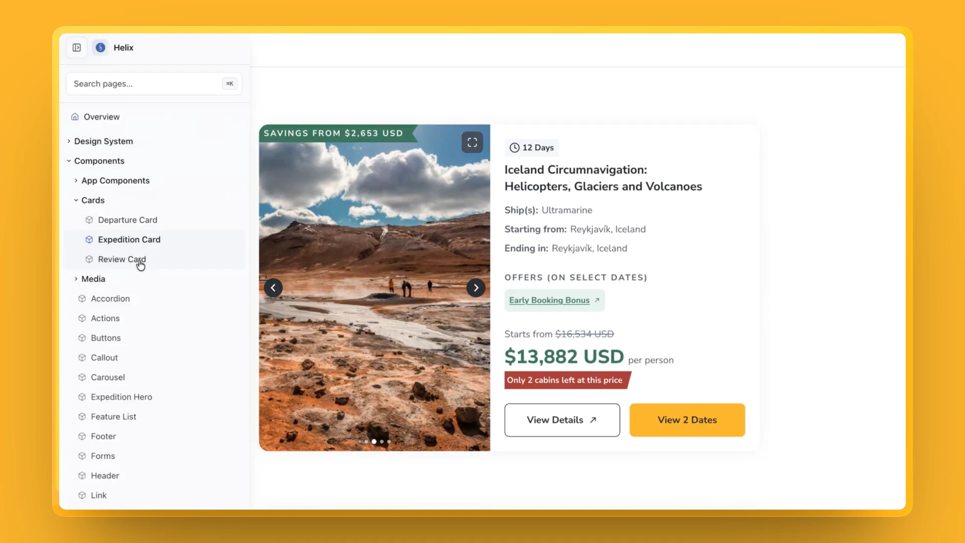
The count is easy to miss
V1 todayFrequent travellers testing V1 lost track of how many trips matched. The count is small grey text at the far right, away from the filters that change it.
In V2Moves the count to the top left, right beside the filters, so every choice shows its effect.
The search box looks empty
V1 todayIts hint, “Search TCS World Travel…”, is near-white on a white field, so nothing says what you can type.
In V2Gives search its own dark band at the top, with a prompt you can read.
Results can’t be reordered
V1 todayTrips always run soonest departure first. Filters can hide trips, but nothing can bring the ones you care about to the top.
In V2Adds a Sort menu above the results.
06.What I learned
What worked
Filters before sorting. We explored sorting, but with 45 trips in the results, changing their order didn’t solve the bigger problem. Filters helped travellers narrow the list to what was relevant. Sorting could follow in V2.
Ship, learn, and iterate. V1 went live a month after the brief. Getting the experience into production gave us an opportunity to see how it worked in practice and identify what needed to improve in V2.
Test with people who know the product. Frequent TCS travellers helped us spot details we had overlooked, including how easy it was to miss the result count.
What I'd do differently
Validate key decisions with users earlier. We knew the result count was visually separated from the filters, but hadn’t recognised how easily it could be overlooked. Testing this earlier could have helped us address it before launch.
Validate the implementation, not just the design. The search hint appeared almost white against a white background in the live build. Reviewing the implemented experience before release would have helped catch this contrast issue.
Plan measurement before launch. Tracking started in July, so the 1.3× growth reflects change since launch, not a true before-and-after comparison. Defining baseline metrics and tracking zero-result searches from day one would have made it easier to understand search performance over time.
Keep reading
Down the hall
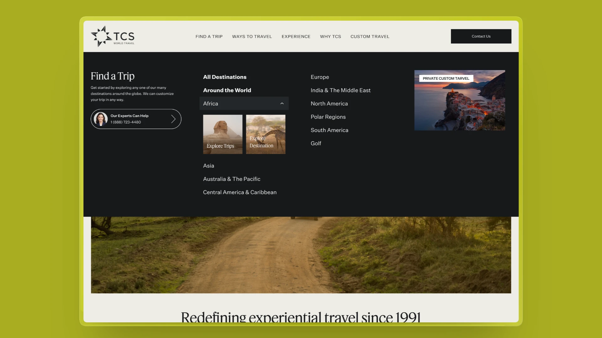 Room 103Letting TCS travellers explore a destination before they bookA two-path choice in the Find a Trip menu, so travellers still exploring can learn about a place first. Built in code, ready for an A/B/C test.
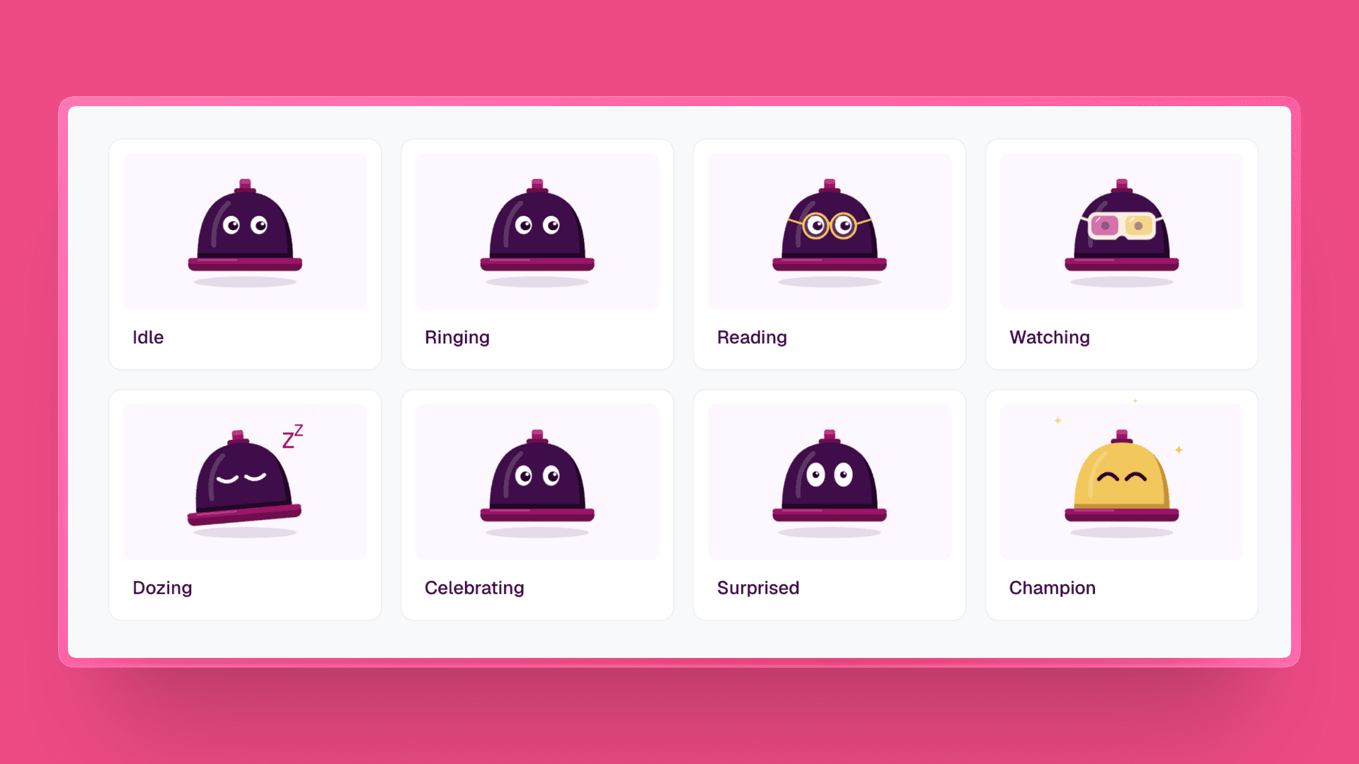 Room 104Designing Bella, the desk bell that hosts this portfolio, in Claude CodeA front-desk bell in the navbar that counts how long you actually spend here.